Exhibition UX Work
Audience Research
Spatial Design
Accessibility
Design Goal
Improved Legibility & Visitor Accessibility
Role
Visual Designer
Timeline(s)
Kickoff- Installation
My work with exhibitions spans the full experience, from helping define visitor outcomes and mapping movement through the galleries to designing individual labels, panels, interactions, and way-finding elements.
Rather than treating exhibition graphics as isolated visual pieces, each decision accounted for where visitors encounter information, how far away they stand, what they can comfortably see, and how that moment connects to the larger exhibition story.
The process below starts with the case label accessibility audit and redesign, then follows that same thinking outward, to wall panels, spatial planning, and visitor flow across the galleries.

Book Labels
The problem
Root cause
Placement and Sizing
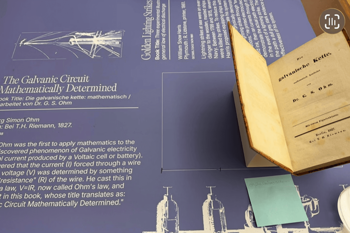
When I started at the library, book labels were placed too far inside the glass display cases, making them difficult to read, especially for older visitors. Their placement and lack of visual hierarchy created a barrier between the audience and the objects.
Labels redesigned as full glass display case mats:
· The books and their accompanying text were moved toward the outside edges of the case, bringing the content closer to visitors.
· Text sizing, contrast, line length, line spacing, and reading distance were considered together to create a more accessible and comfortable reading experience.
· Oversized category titles created a strong central focus, while illustrations and small Easter eggs encouraged visitors to walk around the case and discover details throughout the display.


Process
When Developing the mats:
· Collect measurements of all books at selected spread including width, height, top down depth, and angle for book stands.
· Text adheres to ADA standards. Body uses sans serif and is no less than 36pt and headers are about 64pt. The large theme titles are 250pt so we can place in the center of the mat when we need to (since that is the furthest space from the viewer.)
· Shadows cast from the books are considered. We give them at least 2in of space between and keep this in mind when lighting the cases.
· Once final layout is approved digitally. We print and test all books before installing.


Results
The glass display mats were such a success in their New Acquisitions debut that we continued to use them for future exhibitions.


I map the internal gallery spaces and align the visitor’s movement with the exhibition script. This includes:
· Determining where the exhibition experience begins.
· Establishing the intended order of information.
· Matching narrative sections to physical gallery locations.
· Creating hierarchy across panels and spaces.
· Planning transitions between sections.
· Designing way-finding as part of the interpretive experience.
Early Flow Mapping

Audience Mapping
· Personas are identified so we can account for each type of person.
· We work backwards by applying a likely key experience to a persona. This helps us answer "why is this important to me?"
· The quote beneath the audience label is derived from "why is this important to me?" translating audience motivations into design opportunities.
· Developing low-barrier entry points into complex subjects.
· Considering independent, social, reflective, and exploratory modes of engagement.
· Connecting exhibition concepts to the question of personal relevance.
· Designing for multiple learning and participation styles

Diagram
· Once goals are established along with the concept, we put together a diagram connecting themes

Diagram
· Themes are zoned by matching narrative sections to physical gallery locations
· The flow of the user is drawn out to match up with the narrative.
· This floor plan allows for a non-linear user flow. Each blue section is its own story that links to the bigger picture.
· The red zones are apart of a scavenger hunt. It incentivizes the user to go back through and uncover information they might have missed.

I apply the same spatial thinking to panels and wall text:
· Map the height, width, and position of each panel.
· Determining text size based on viewing distance and installation height.
· Keeping important body content within a comfortable field of view.
· Avoiding placement of essential content too low on the wall.
· Enlarging titles and other information positioned above normal reading height.
· Determining text size based on viewing distance and installation height.
Gallery Wall Dimensions


Way-finding Signage
· Designing way-finding as part of the interpretive experience.
· Planning transitions between sections.
· Using large titles and visual moments as orientation points.


