Library Catalog Audit
UX Research
Heuristic Audit
Audit Goal
Improve discoverability & accessibility
Role
Researcher
Timeline
Audit - Evaluation
My director, asked me to leverage my UX process from the web agency when I was onboarded to the library by auditing the website, navigation, and catalog. I organized staff feedback into a spreadsheet, as well as a competitive analysis.

The process
Retroactive Process
The website redesign task was reprioritized for later down the road to make way for other projects. I saw the opportunity to expand upon my research as a way to practice my digital UX thinking while working with exhibitions.
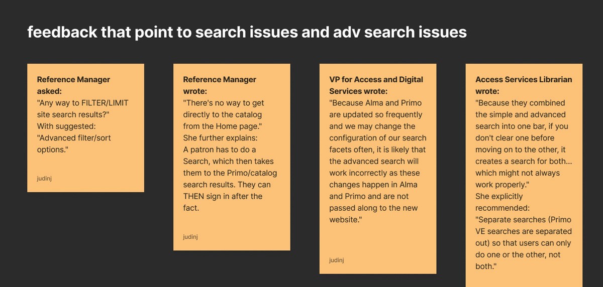
After organizing feedback I put together a string of comments that pointed to the catalog search tool as candidate for improvement.
Usability Testing
I did a cognitive walkthrough and then used Copilot to help me setup a usability test tasks list and post testing interview questions.
I put together a three different users who felt far enough in between to give me slightly different outcomes and observations about the catalog search function.


Users Start
The users quickly found catalog in search. Catalog is set as default when visiting the landing page.
Screenshots
Catalog screenshots are from user screen-recordings and quotes are from their audio as they think out loud. Prompt encouraged users to voice opinions.


E-Books Hidden
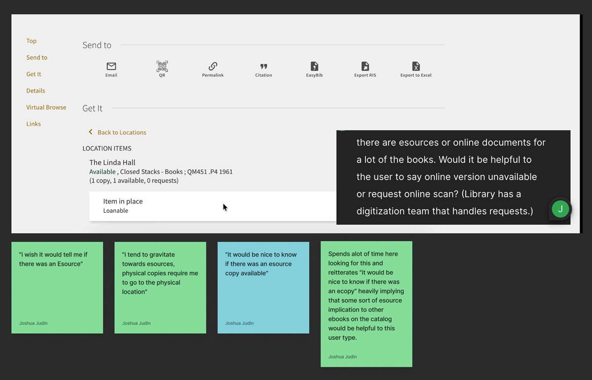
Both User 1 and 3 ask where the ebook is and spend time looking for it. There is no indicator that there would be an ebook but the user expects it.
Looking for e-Book
User 1 thinks/ hopes the "send to" is an option to send herself an e-book. Realizes it is a cluster of sharing the book catalog link and citations exports. This takes her a second to figure out and writes this off.

Related Books
User 1 & 3 really like the virtual browse. This gives them more related topics. They wish this section gave them more information (such as an image.) They do spend a lot of time here before moving on to the search input. Backing out of the initial book search pop-up was confusing. The pop-up/ book selection needs to be more obvious of what it is and where the exit is.

Biggest Finding
From here all three users were looking or mentioned e-books. I knew that e-books existed on the catalog but going in with a narrow search really limits when and if you will discover e-book existence. By looking up a book or specific topic with no digitally scanned version(s) you slow your ability to discover the "online books" sooner.


Lacking Accessibility and Discoverability
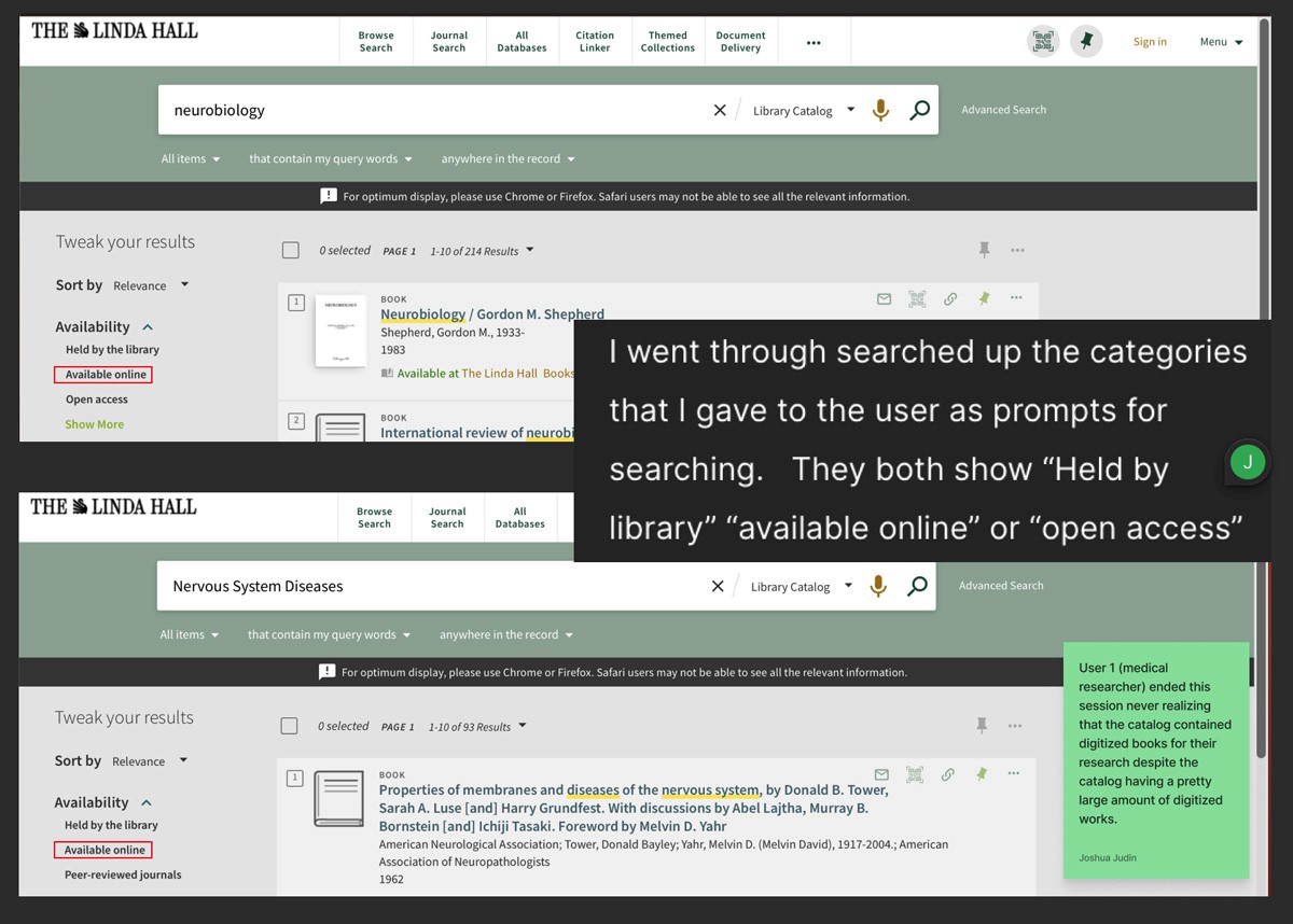
I did a cognitive walk-back after my usability testing and put both topic prompts I had given the users to double check that "Available online" would show.
User 1 never found this filter and never realized the e-books were on the catalog for research due to the fact she strayed away from my prompts and used topics she felt were more relevant or familiar.
Questions I started to ask:
· Why is the search input the first and obvious visibility to the catalog?
· With so many patrons outside of the city, shouldn't online books be highlighted?
· Could filter be grayed out instead of omitted, a "request for digitization", or "no digital version available" could help the user realize the catalog had e-books elsewhere?

Retroactive UX for the Initial Purpose
Redundancy before Redesign
The original quoter encouraged users to build a custom system from the start:
· Resulting in an experience that behaved more like an ecommerce product filter
· School administrators and new buyers were often asked to make decisions about GPUs, brands, and performance tiers before understanding what equipment was actually needed


